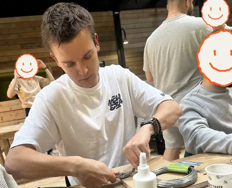


Alexander at a workshop table bending wire with pliers for the Plantitude prototype. The people behind him have hand-drawn smileys over their faces

Design work

I like to sit with a problem until I've pretty much experienced it myself. And I ask a lot of questions, usually at the most random moments.

I draw first. I can get a thought straight onto paper, in dimensions, with dotted lines, whatever it needs. With a mouse and a flat screen I can't sense the same depth. And on paper I see right away if something's off, or I can just show it to someone.

YourExpression

A guitarist walks on stage and you can see what they can do. A producer behind a laptop has nothing like that. This is a sandbox for body expression: a performer turns their own movement into sound, so the room can see the music being made.

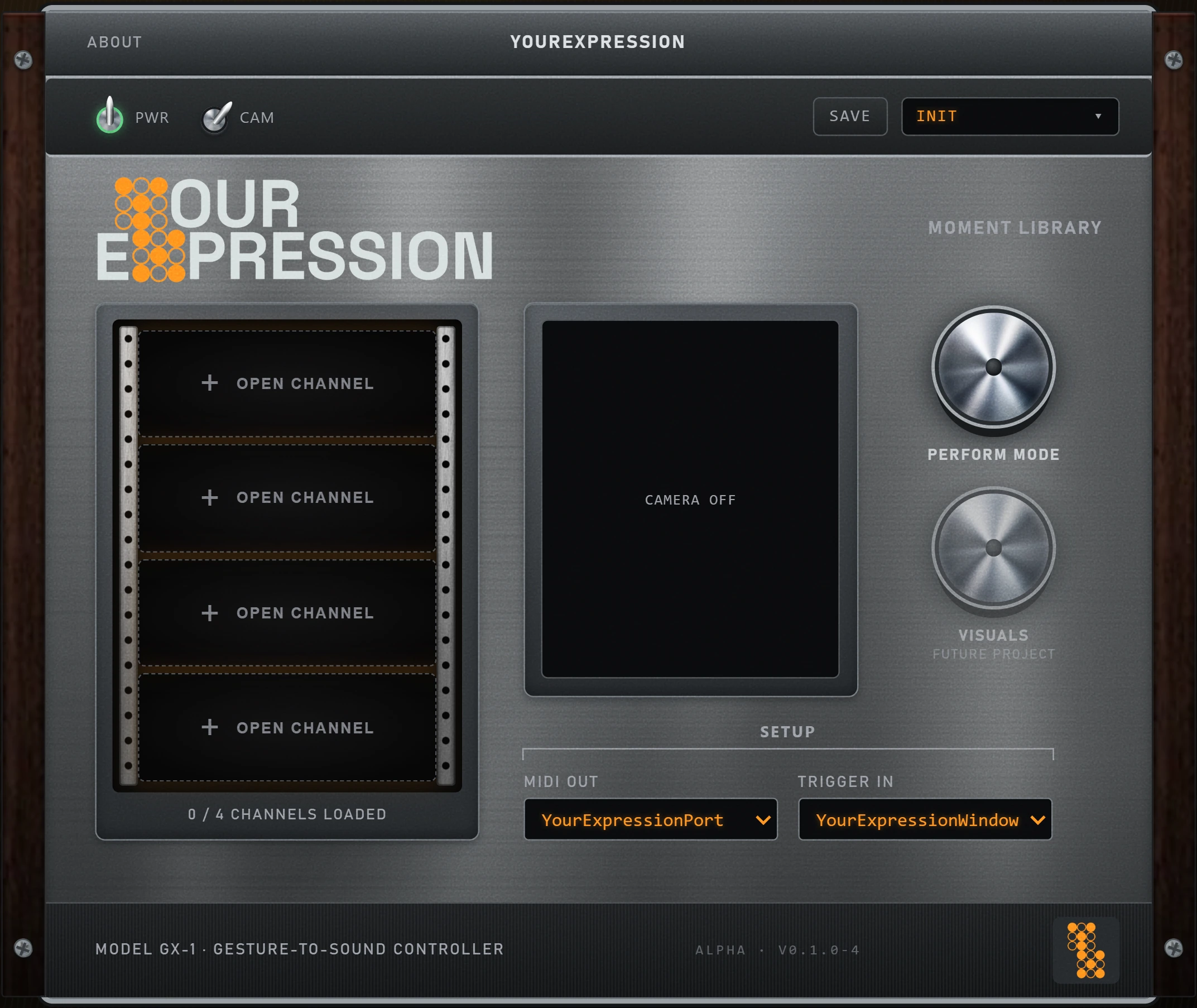
The YourExpression app: a brushed-steel rack with four gesture slots, a camera view and a perform dial

The problem

After my sets I like asking people what they thought. Most of them didn't know I'd made the track, or that I was a producer at all. So the question became: how can design make a live electronic set feel live, so that who made the music is felt and doesn't have to be explained?

My process

I went in thinking the answer was transparency: screens showing the kick, the bass and the melody as they happen. The research said no. People don't care about the technical side. They care about feeling that something is happening right now.

So the job changed from explaining the music to guiding attention, like a spotlight operator in a theatre.

"I do not need a thousand followers, I need ten people in a room who actually get it."One of the live performers I interviewed
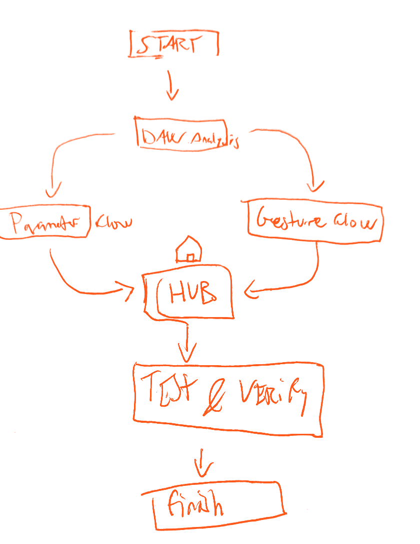
Flow diagram from start through analysis, hub, test and finish
1. The flow, start to finish
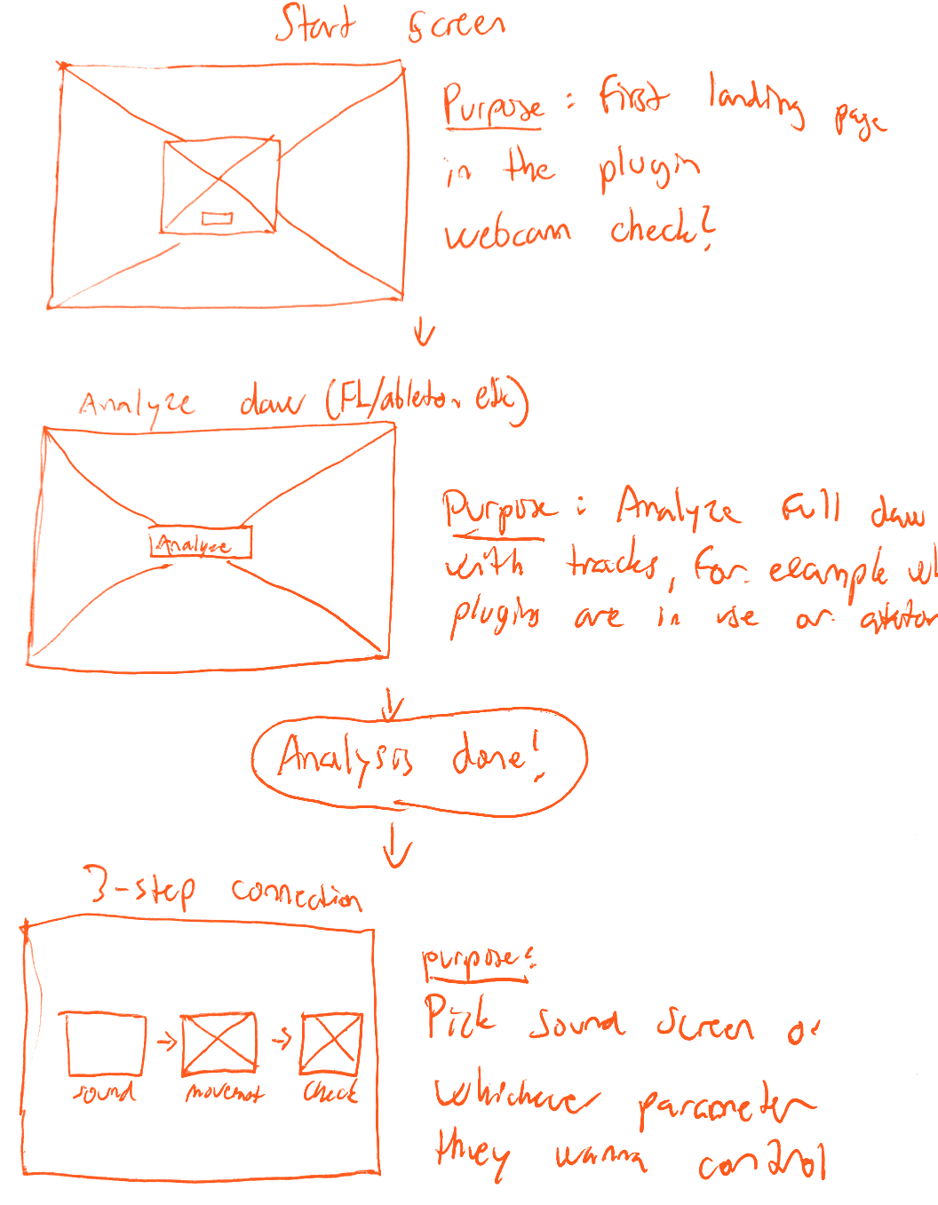
Wireframes of the start screen, the analysis screen and the three-step connection
2. First wireframes
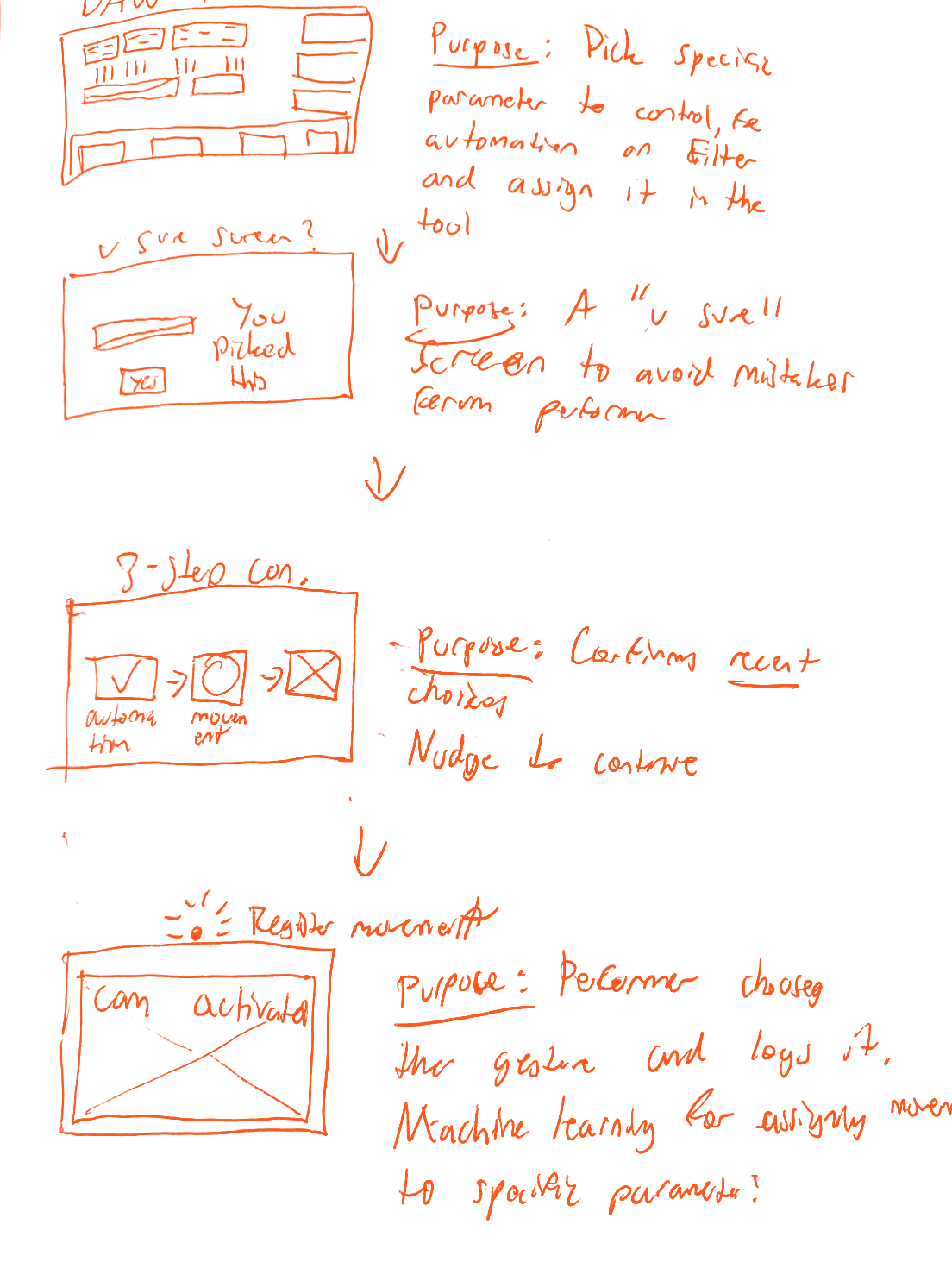
Wireframes of choosing a parameter and recording a gesture, with a purpose note beside each
3. Setup, step by step
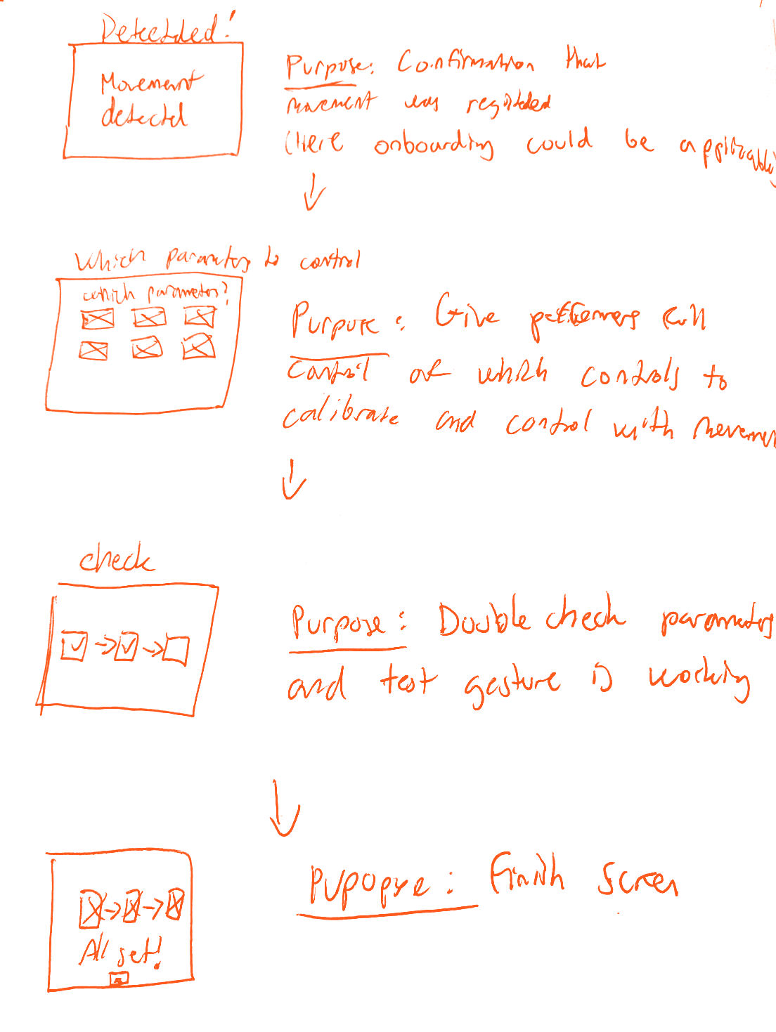
Wireframes of the detected, parameter and check screens
4. Confirm and check
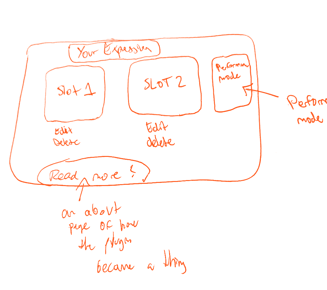
The very first sketch of the main screen: two slots and a performance mode button
5. First sketch of the main screen
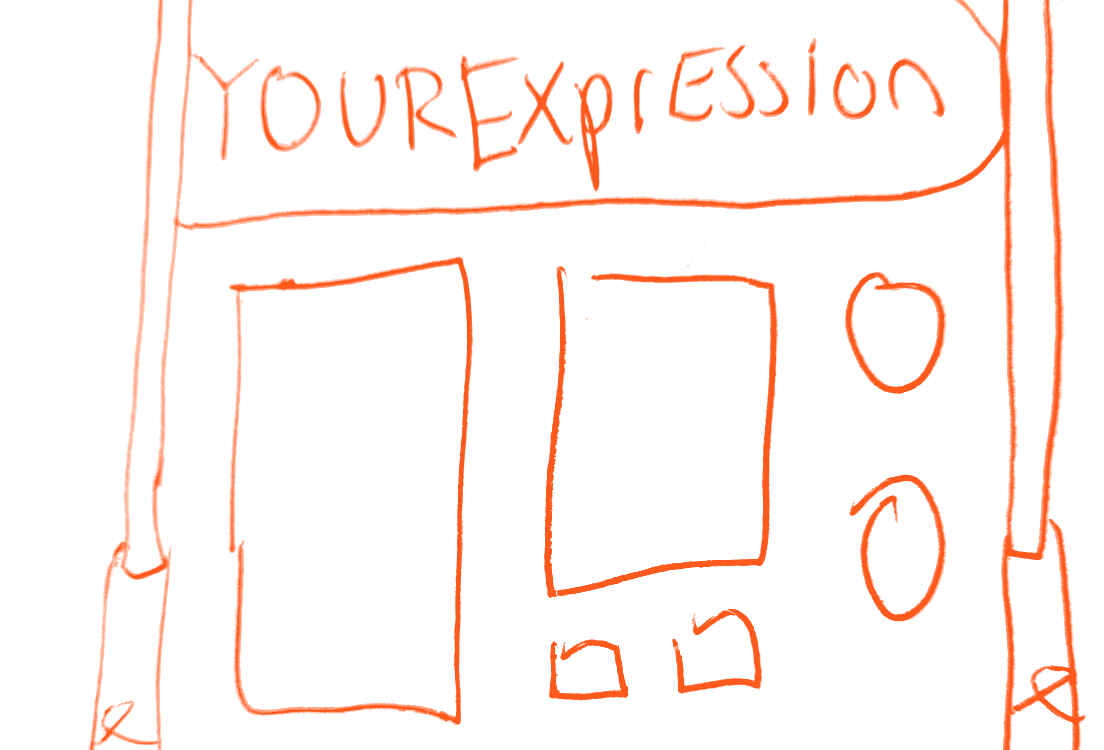
The second sketch of the main screen: a title bar, two panels and round buttons
6. Second version, which became the final look

How I solved it

An app that sits next to your music software and watches you through the laptop webcam. You record your own movement, link it to anything in your set, and on stage the sound follows. This version reads hands. The idea is the whole body.

I kept it to four moments per set. If every move controls something, nothing stands out, so each one has to count. And the moves are yours, not mine. The tool only does the tracking. You pick the movement and what it controls.

Try it yourself

This is the actual app, running in your browser. Switch on CAM and it will ask for your webcam, so you can record a real gesture. The video stays on your own computer.

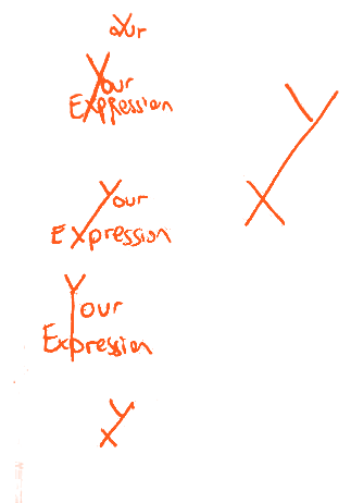
Pen sketches trying out different ways to write YourExpression and a YX mark The YX icon: orange dots on a dark rounded square The YourExpression wordmark with the Y and X built from orange dots

The logo: a dot-matrix YX. The dots are the points the hand tracking draws on your hand.

Tested live

Testers kept holding a still pose when the tool needs a movement, so now the button stays locked until your hand has actually moved. Then I played my EP live for four people who had no idea what the project was.

"You were not just the body behind the turntable, you were communicating your music physically."Someone in the audience

To them it felt more live. They saw the movement, the keys and the music as one thing. Did they get that I made the music? Partly. Some of them already knew I produce, so I can't fully separate the two.

The catch is that the moments are subtle and easy to miss. That's what I'm testing next.

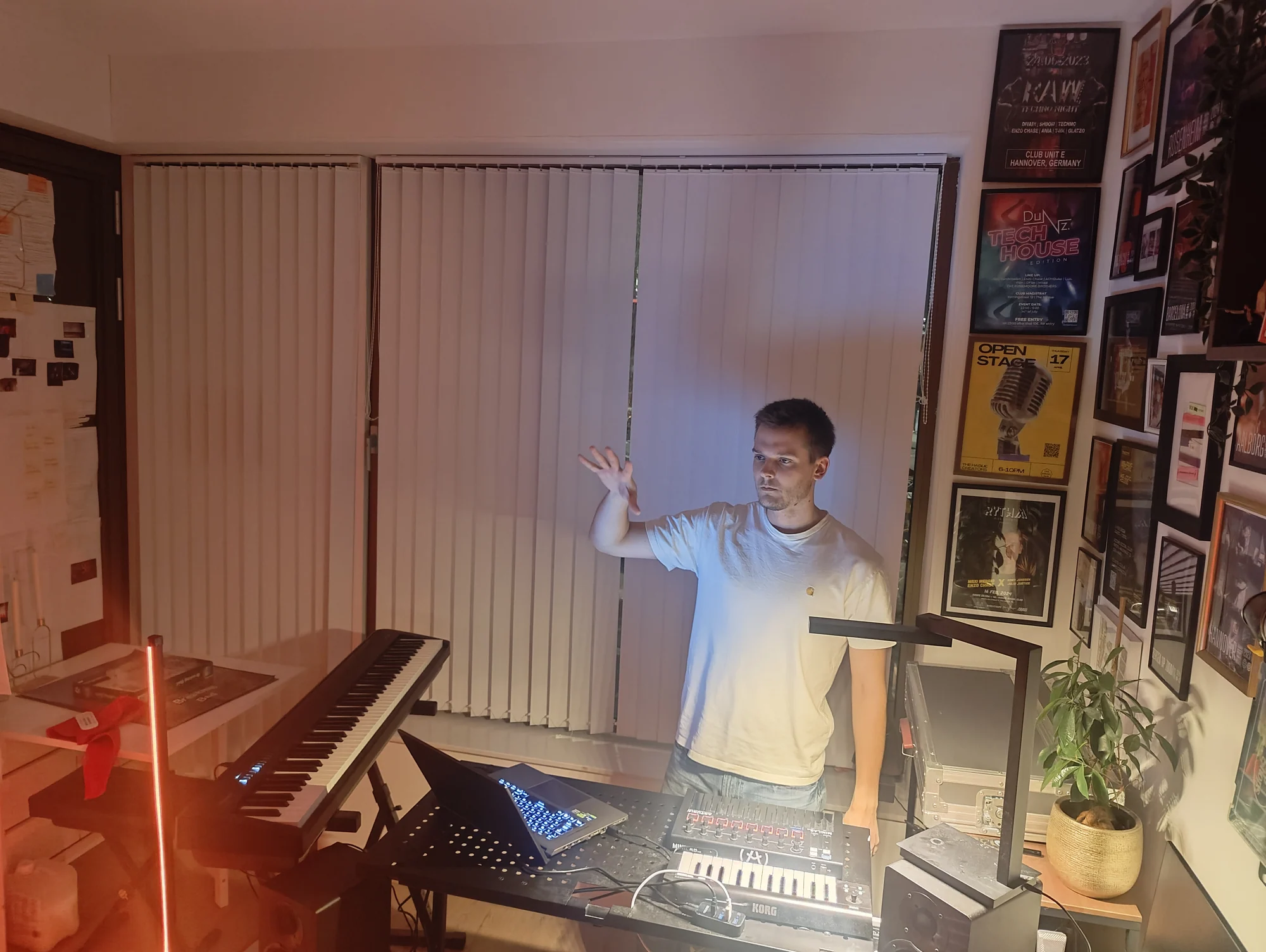
Alexander at his live rig at home, one hand raised toward the webcam during the final gesture

Graduation project, 2026 · CMD UX Design, The Hague University of Applied Sciences · Self-initiated, with mentors, interviews, surveys and five rounds of usability testing

Selected work

DocGov 2025

Government documents that regular people can actually search

The problem

Governments legally have to show how they spend money and make decisions. But good luck finding anything, and when you do, the documents read very academic.

My process

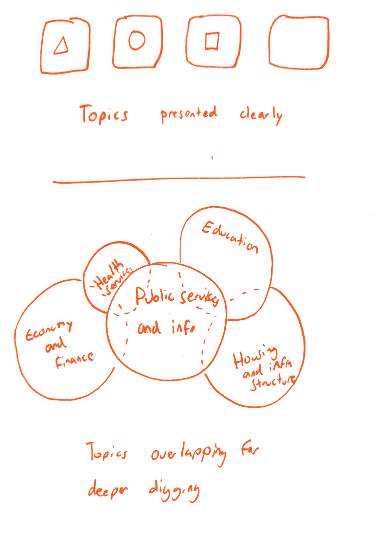
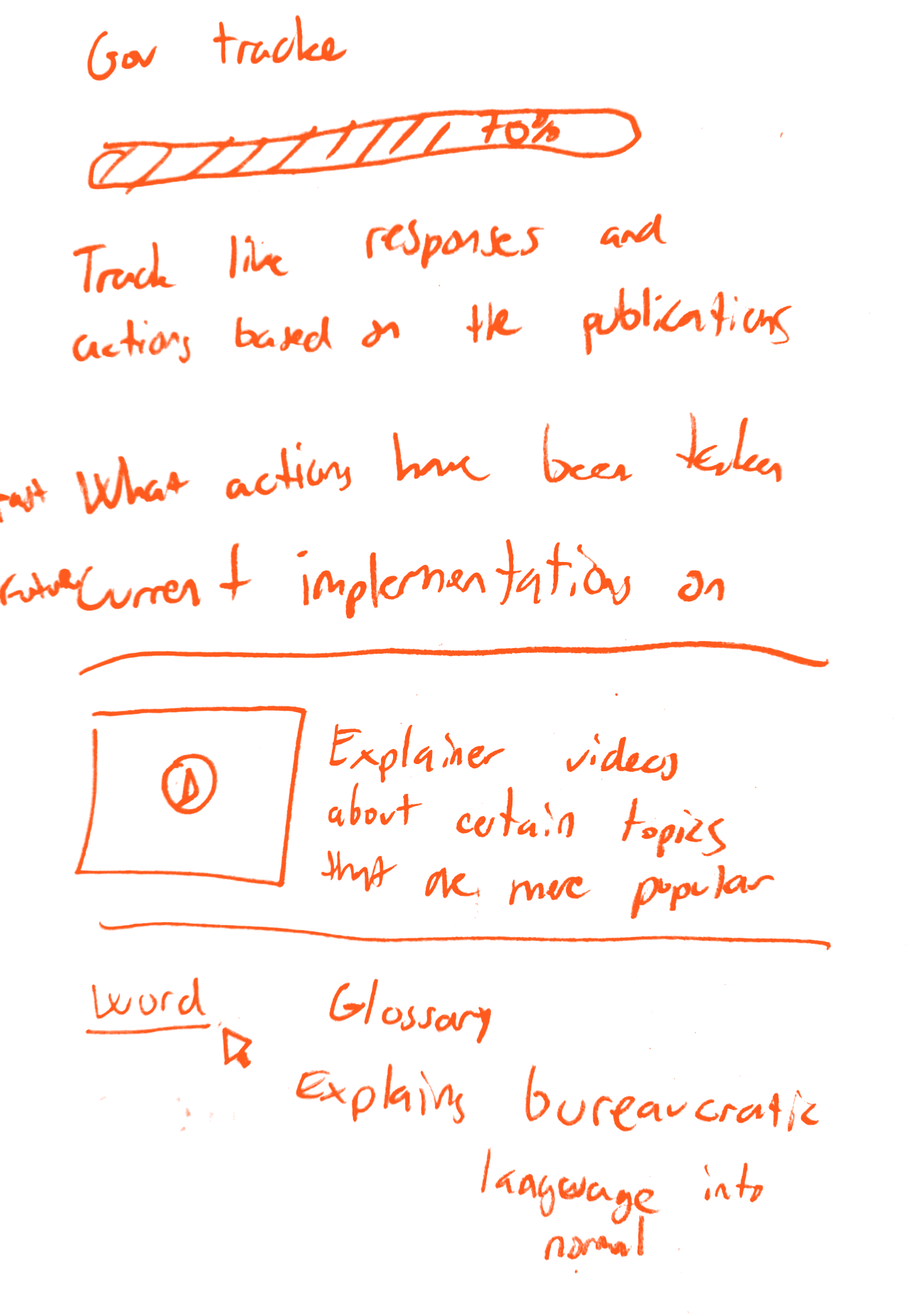
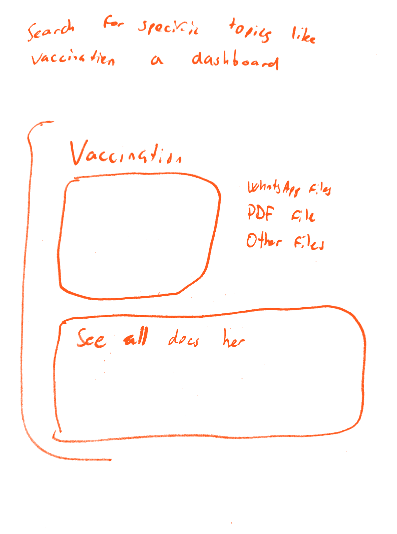
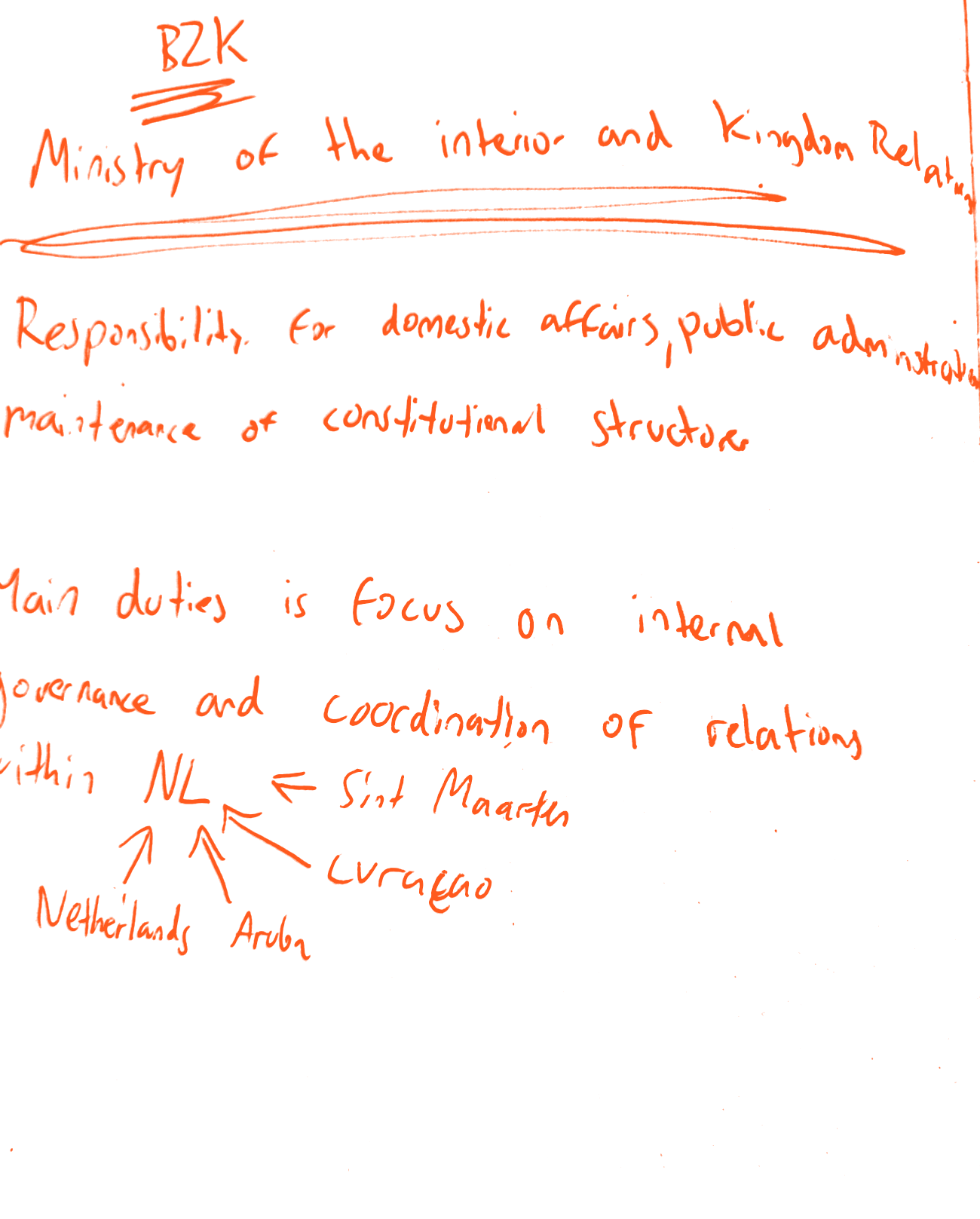
I talked to citizens, investigative journalists and data journalists, and started on paper: what to ask the ministries, how the topics overlap, what a search could look like. I did all the interviews, the findings and the full design in Figma. Four ICT students built it from there.
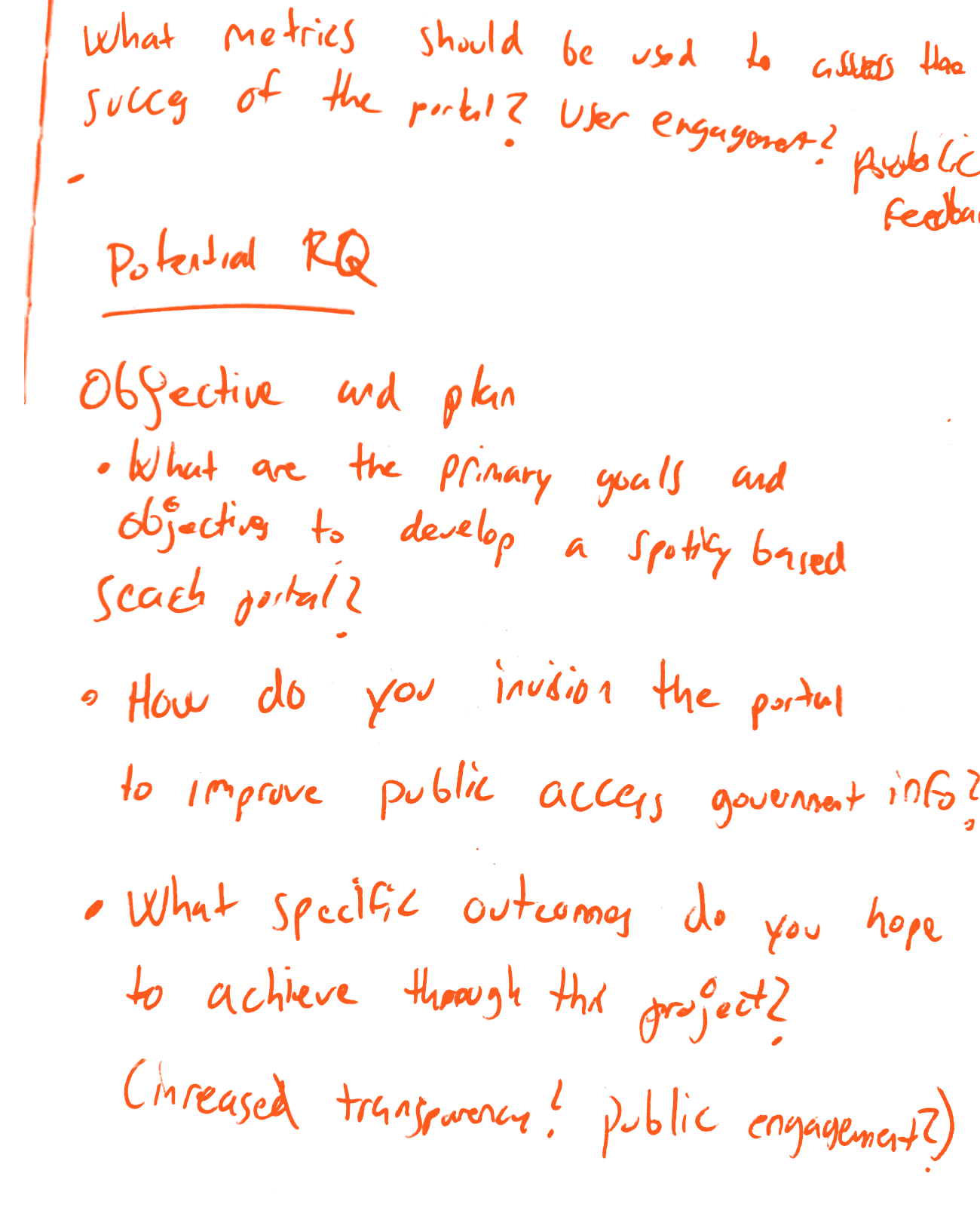
  • Notebook page: research questions on the goals of the portal and how to measure itWhat I asked the ministries first
  • Sketch: topic tiles and overlapping circles for education, health, economy and housingHow the topics overlap
  • Sketch: a government tracker bar, explainer videos and a glossary for bureaucratic wordsEarly ideas: tracker, explainers, glossary
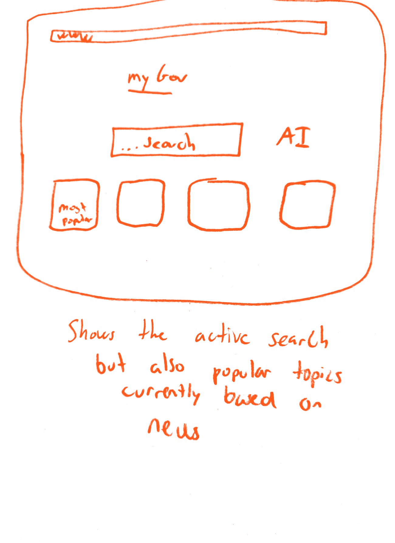
  • Pencil wireframe: a search field, an AI label and tiles for popular topicsFirst go at the search page
  • Pencil wireframe: a topic dashboard for vaccination with file types and a list of documentsA dashboard per topic

How I solved it

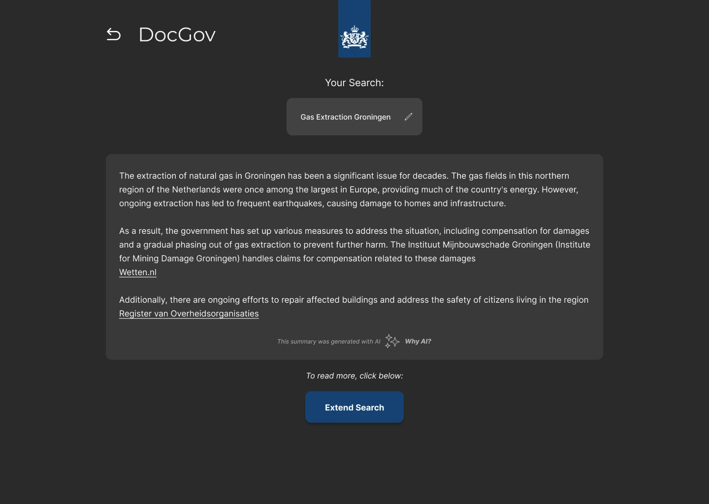
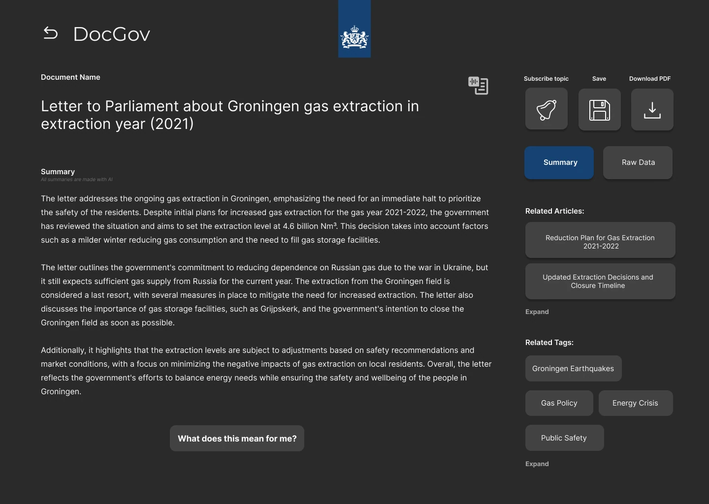
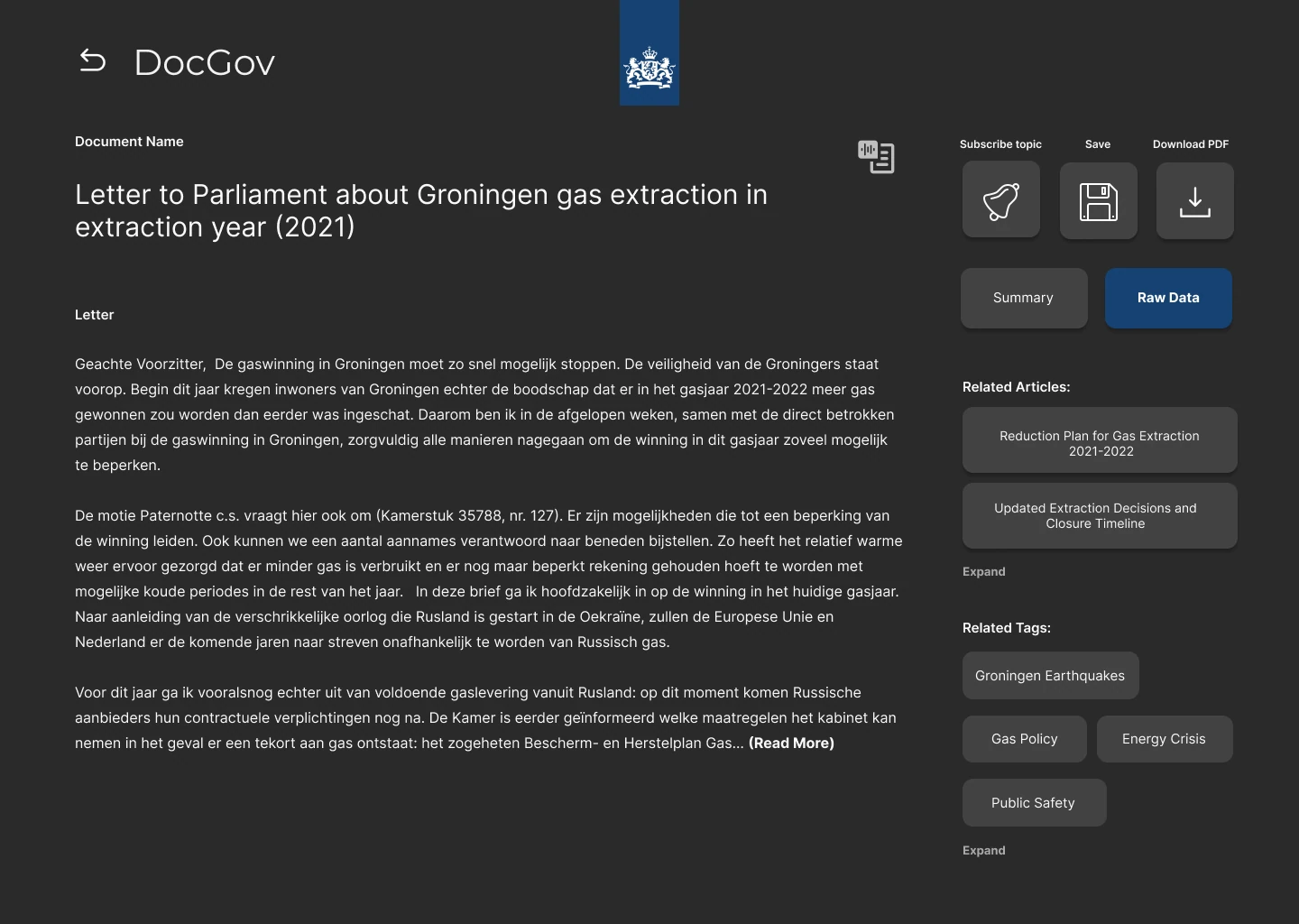
A working AI search. You ask something like "what's going on in Groningen?" and get a quick summary with the sources, plus a button that just says "What does it mean for me?". The journalists wanted the opposite: the raw document, nothing summarised. So every result can flip between the two.

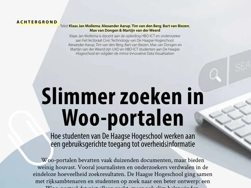
It didn't stop at school. Programma Transparant said we delivered what they needed, and wanted to look at taking it further with other ministries. We got invited to present it a few times, and I co-wrote an article about it that was printed in Od, a magazine on government information: Slimmer zoeken in Woo-portalen (issue 44, May 2025, in Dutch).
See how it works A 1.5-minute demo of the search, the summaries and the word web. Recorded by Max from the team. Watch on YouTube · 1:37 The opening page of the article Slimmer zoeken in Woo-portalen in Od 44, with Alexander Aarup in the author line In print Slimmer zoeken in Woo-portalen. Od 44, May 2025, pages 24 to 26. In Dutch. Read the article
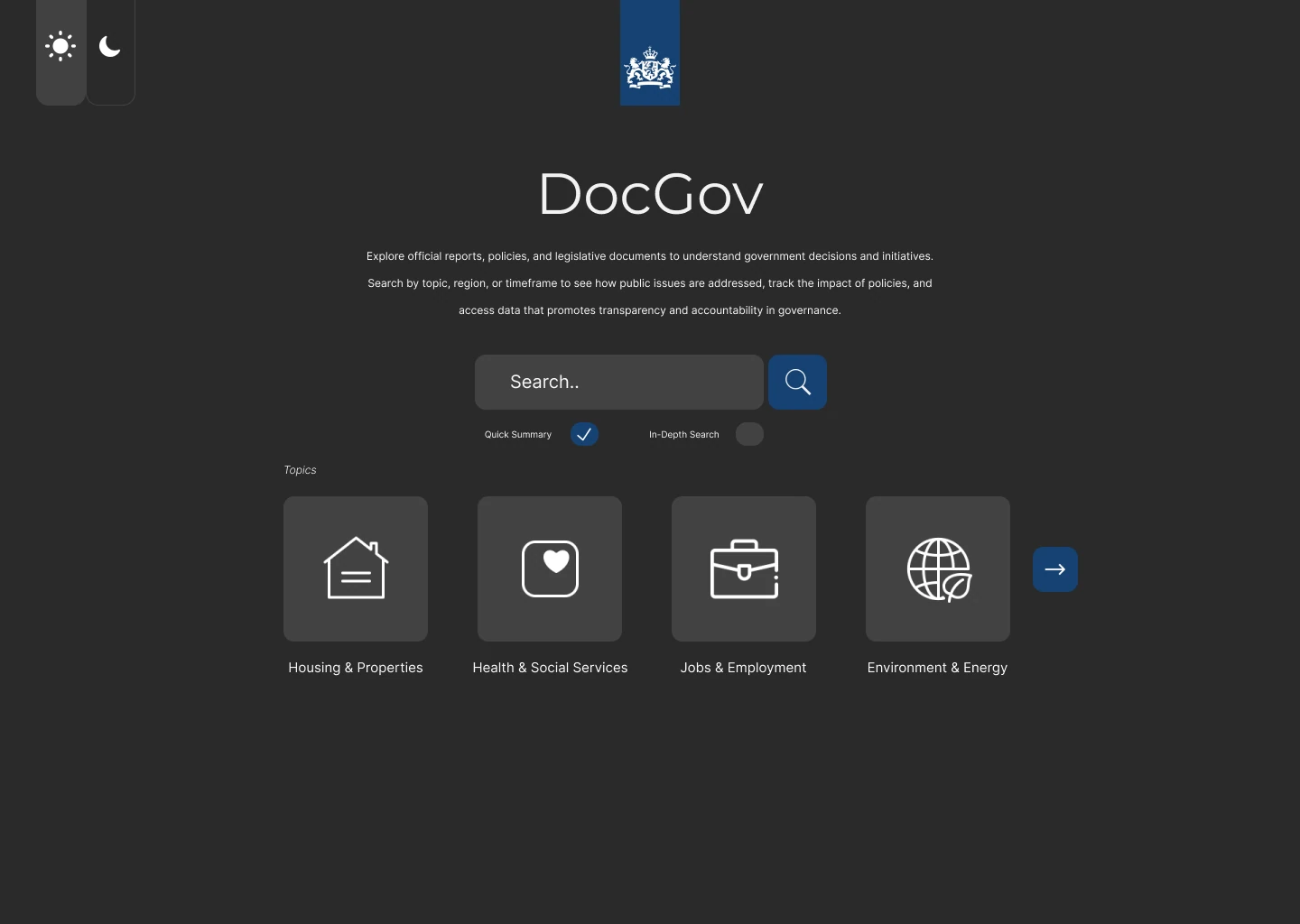
DocGov home screen with a search field and four topic tiles
Start: ask a question or pick a topic
A short AI summary about gas extraction in Groningen with source links
The quick answer, with its sources
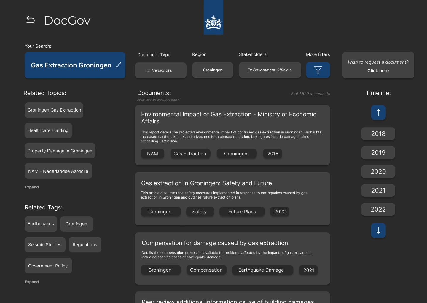
Search results with related topics, tags, ministries and a timeline of years
Digging deeper: filters, tags and a timeline
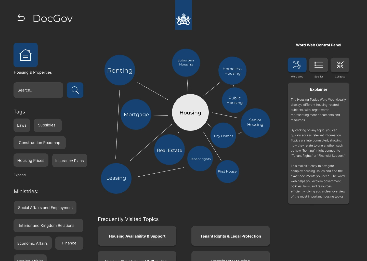
A map of linked topics around housing, with an explainer panel open
Browsing by topic, with an explainer
A letter to parliament shown as a summary, with a button that says What does this mean for me
One document, as a summary
The same letter to parliament shown as the original Dutch text
The same document, raw and untouched

UX designer, with four HBO-ICT students · Minor Innovative Data Visualisation · For the Ministries of the Interior, of Housing and Spatial Planning, and of Education, through I-Lab West · Published in Od 44, 2025

Plantitude 2025

A sunflower with a mood. Shine a light on it and it's happy, get too close and it tells you off

The problem

A human-computer interaction project about artificial creatures. The question: how do you make a machine react to you in a way that feels alive?

My process

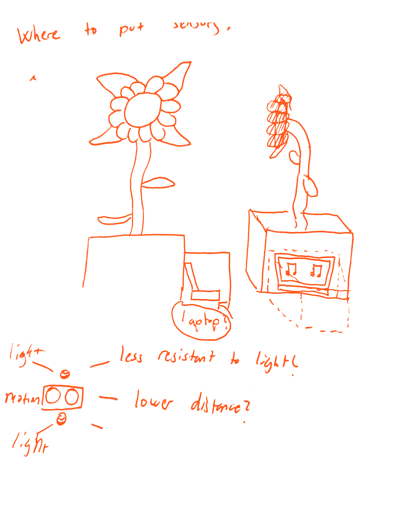
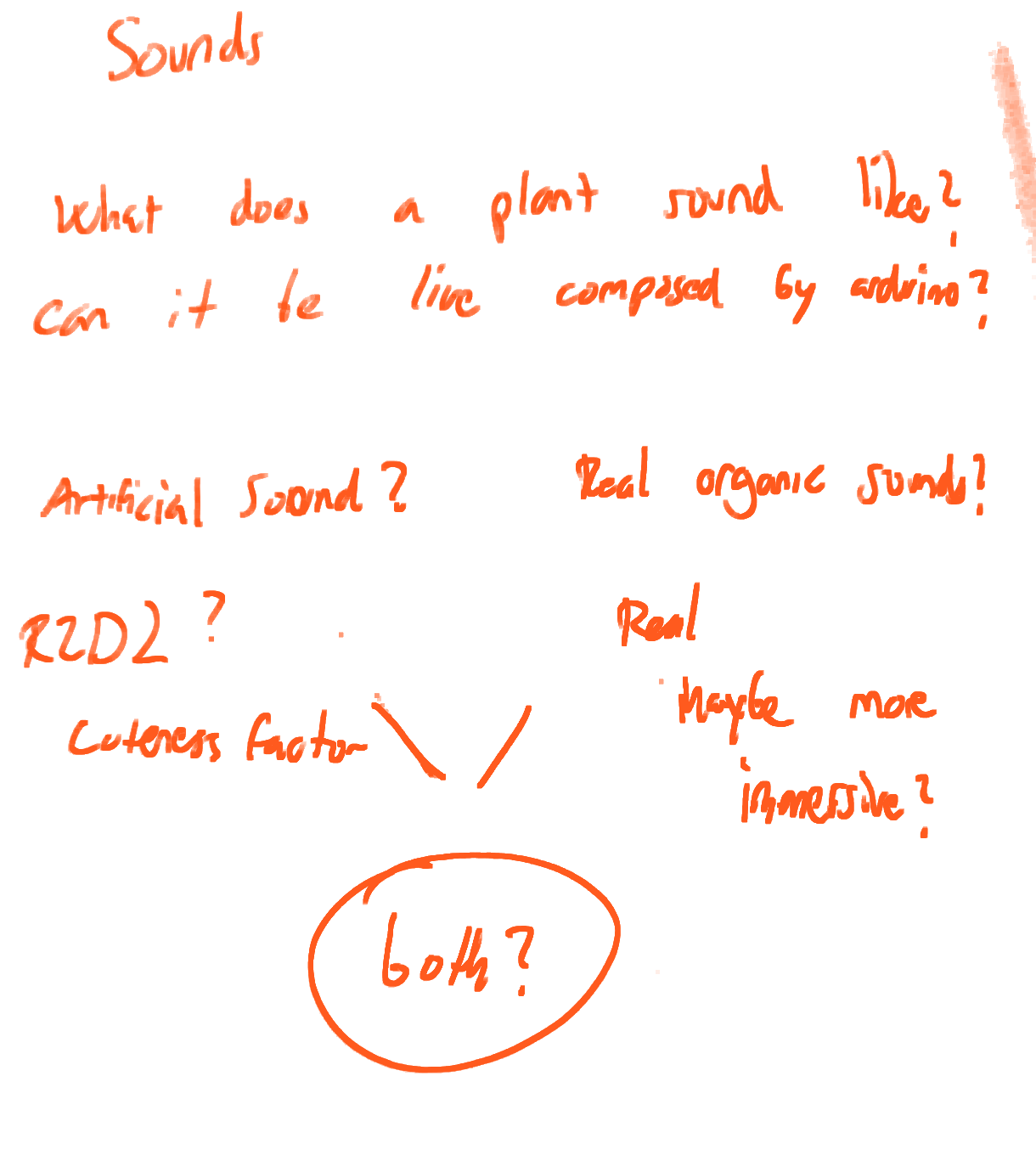
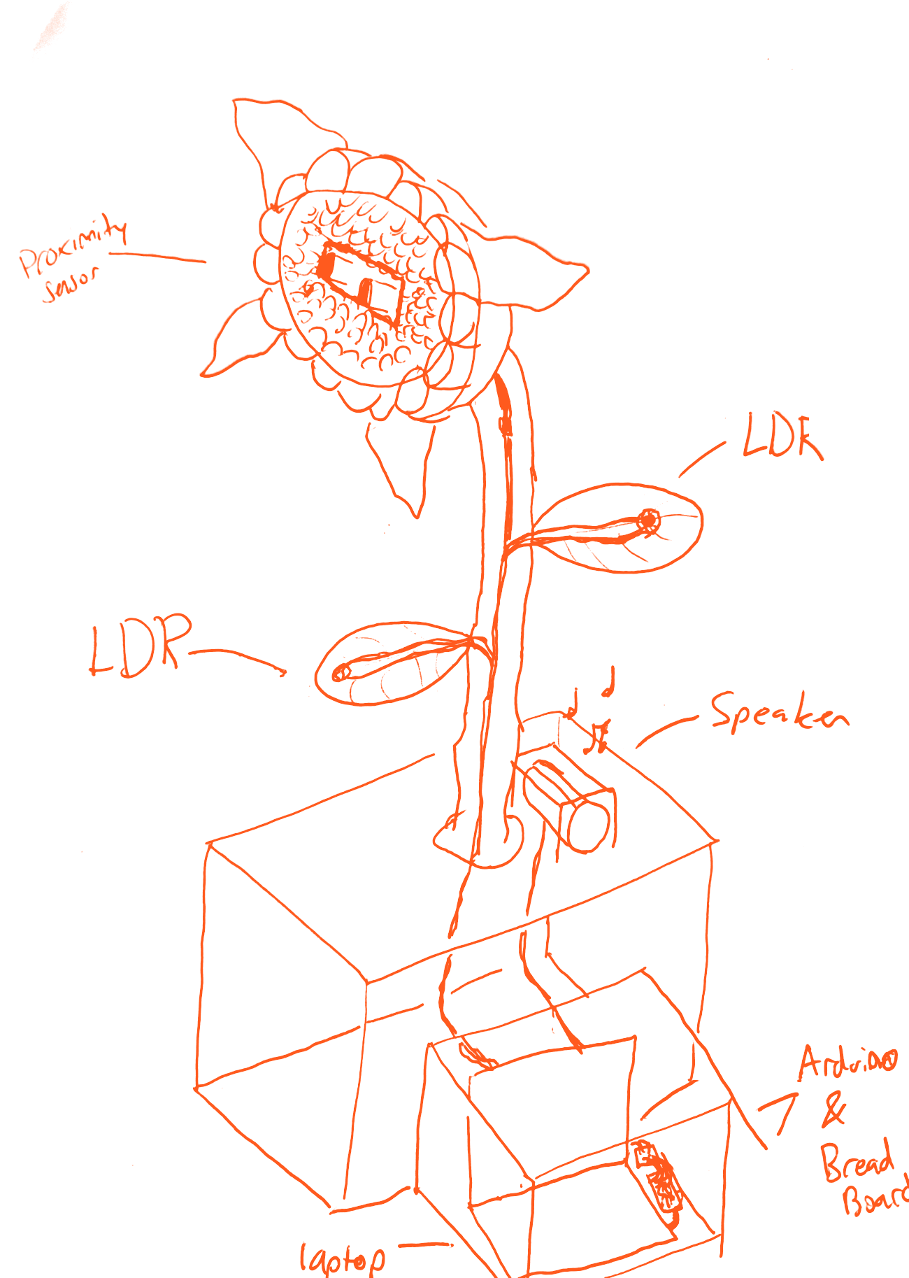
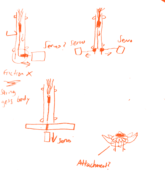
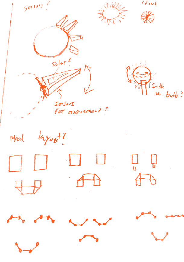
Two weeks in the lab, team of five. I took the sound, because that's my world, and connected it to the sensors. I drew where every sensor had to go first, and tested the wiring on my own houseplant before it went into the real thing. The hardest part was the light: you need exactly the right rays hitting a sensor before it behaves.

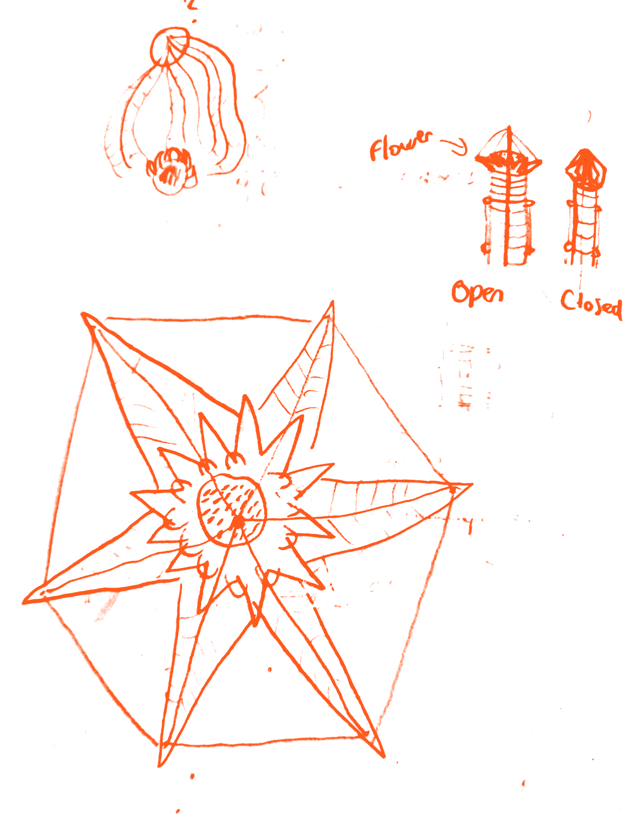
I also built a way for the leaves to close around the head when you get too close, with bits of a lollipop stick as guides for the strings. Honestly proud of that one. Closing worked, opening it again needed another servo and more time, so we cut it to finish on time.

  • Sketch asking where to put the sensors: a flower on a box, a laptop, light and motion sensors with notesFirst question: where do the sensors go?
  • Notebook page: what does a plant sound like? Artificial like R2D2 or real organic sounds, with both circledWhat does a plant sound like?
  • Pencil sketches of the flower head from above and of the flower open and closedThe flower, open and closed
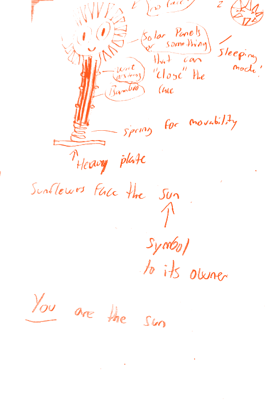
  • Drawing of the finished sunflower with proximity sensor, light sensors, speaker and Arduino labelledWhere every sensor ended up

How I solved it

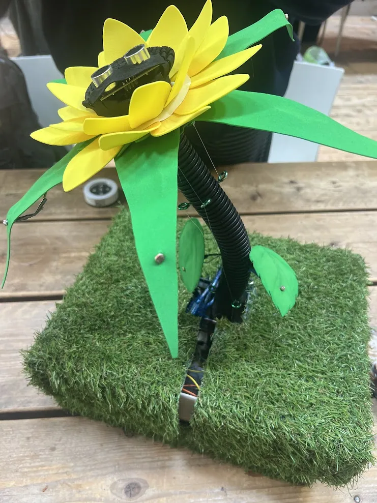
A sunflower that runs on Arduino. Shine a light on the leaves and it makes happy sounds, because it's photosynthesising. It turns to face wherever the light comes from. Get too close to its head and it starts complaining, and the closer you get, the angrier it sounds.

None of it is recorded. I designed the synth in Serum, a bit R2-D2, and the sensors play it live. At the expo people started playing it like an instrument. That was the first time I made music out of sensor data. I wasn't thinking of it when I started my graduation project, but looking back, it definitely nudged me that way.

The finished Plantitude: a foam sunflower with a sensor in its head, on a block of artificial grass
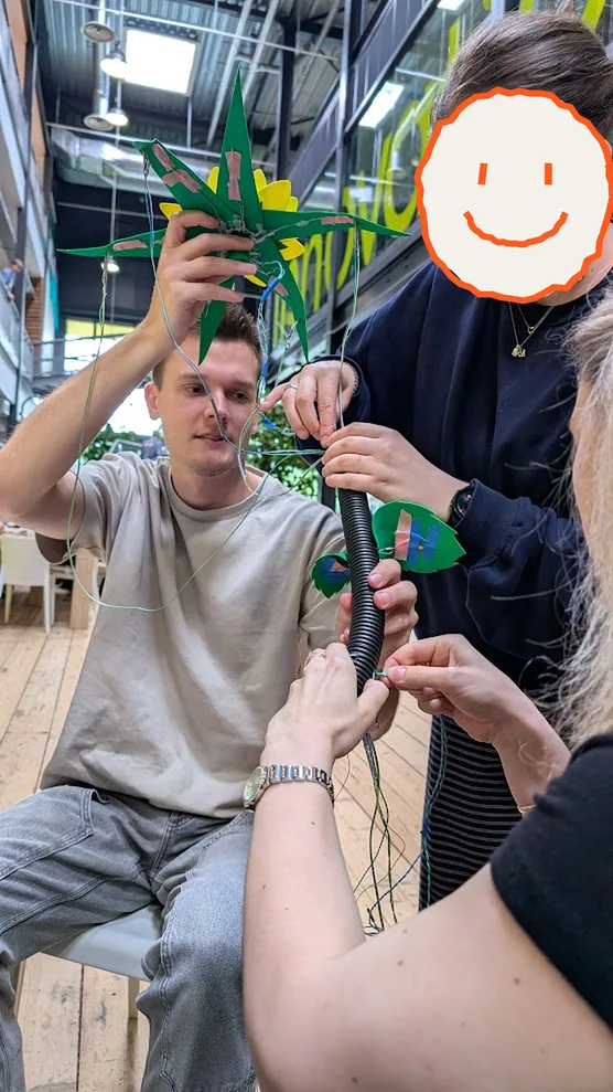
Alexander holding up the flower head while two teammates, faces covered with drawn smileys, thread the wires down the stem
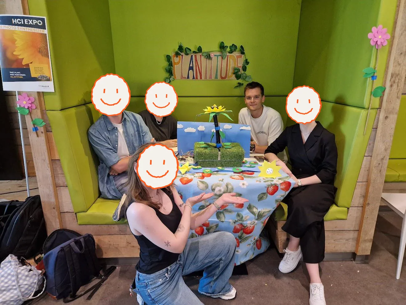
The Plantitude team in their booth at the HCI Expo, with the sunflower on the table and the Plantitude sign above them. Alexander sits at the back in a white T-shirt, the others have hand-drawn smileys over their faces
The whole team at the HCI Expo. I'm the one without a smiley.

Team of five · Shown at the HCI Expo

Client websites 2024–26

Websites I designed and built for small businesses, all with a mobile version too. Every one was a different world, so here they are one by one

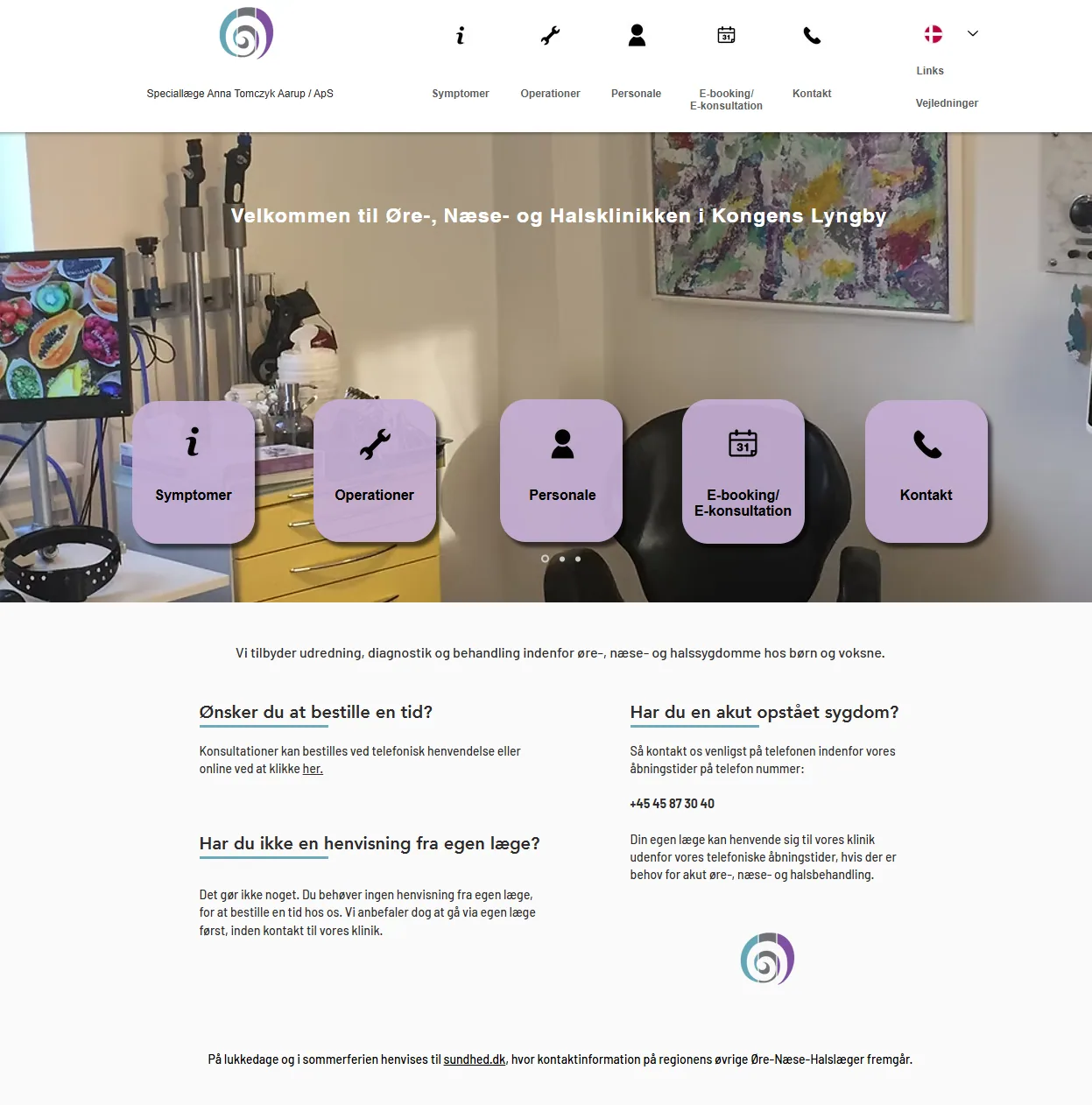
  • Ear, nose and throat clinic home page

    ENT clinic 2024 · Denmark

    An ear, nose and throat clinic in Lyngby. Patients needed to get in touch fast, and a lot of them want to know what might be wrong before they even call.

    So booking and contact sit right up front, and there's a symptoms section where people can look up their problem first.

    See the site
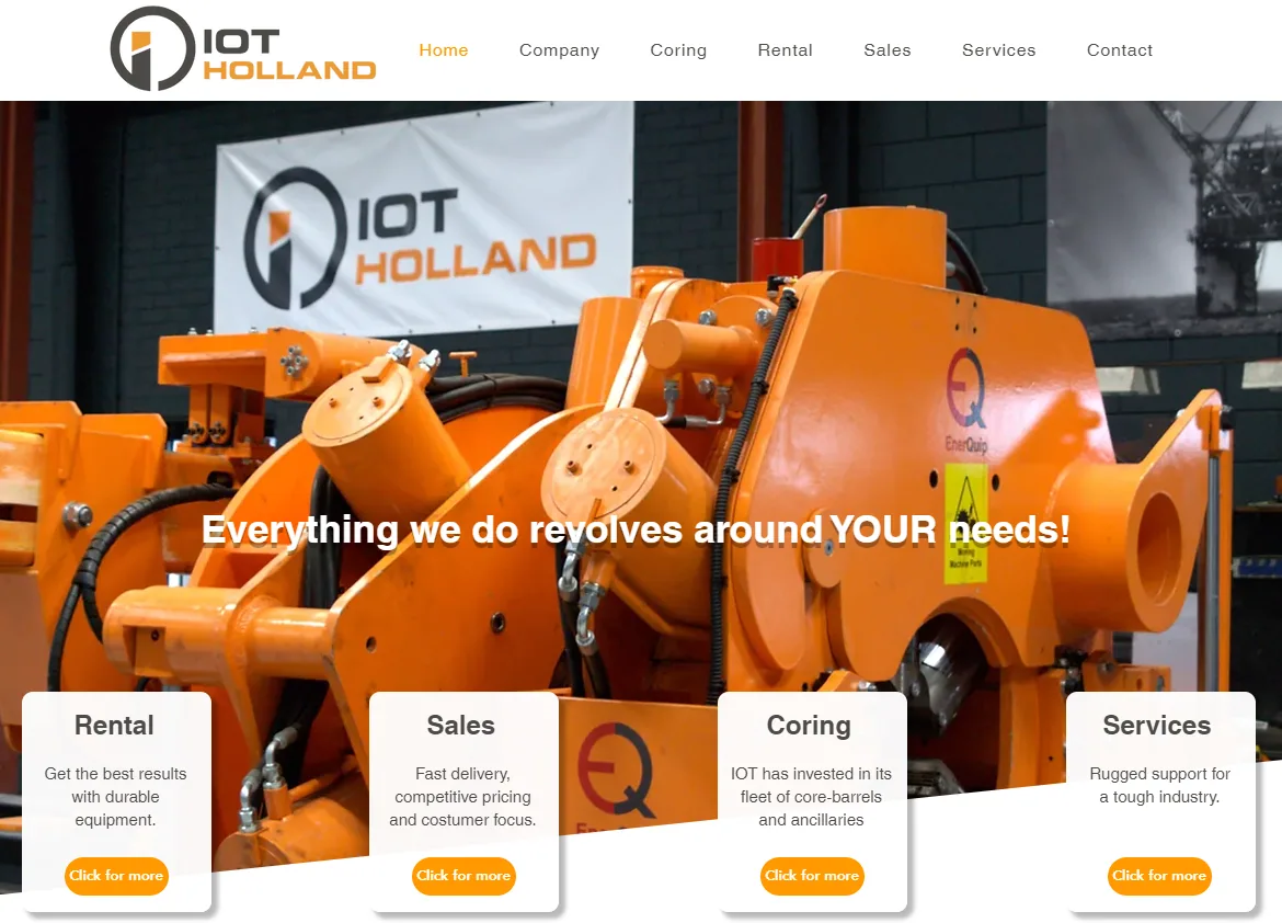
  • IOT Holland home page

    IOT Holland 2025 · Netherlands

    Drilling and coring gear for gas and mineral extraction. They needed a fresh site where clients can reach them and see the jobs they've done.

    I built it around the case studies and getting in touch, and made 3D models of their drilling tools. The screenshot is from when I made it. Someone else runs the site now, so it looks a bit different today.

    See the site
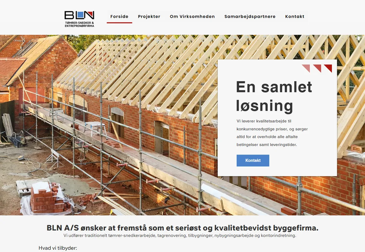
  • BLN home page: a new roof frame going up on a brick building, with the heading En samlet løsning

    BLN 2025 · Denmark

    A Danish carpentry and building firm. They wanted customers and property developers to find them, and needed a place to show their work, like a roof or a set of windows that had to be replaced.

    So I built the site around their projects, so new customers can see what they've done before they get in touch.

    See the site
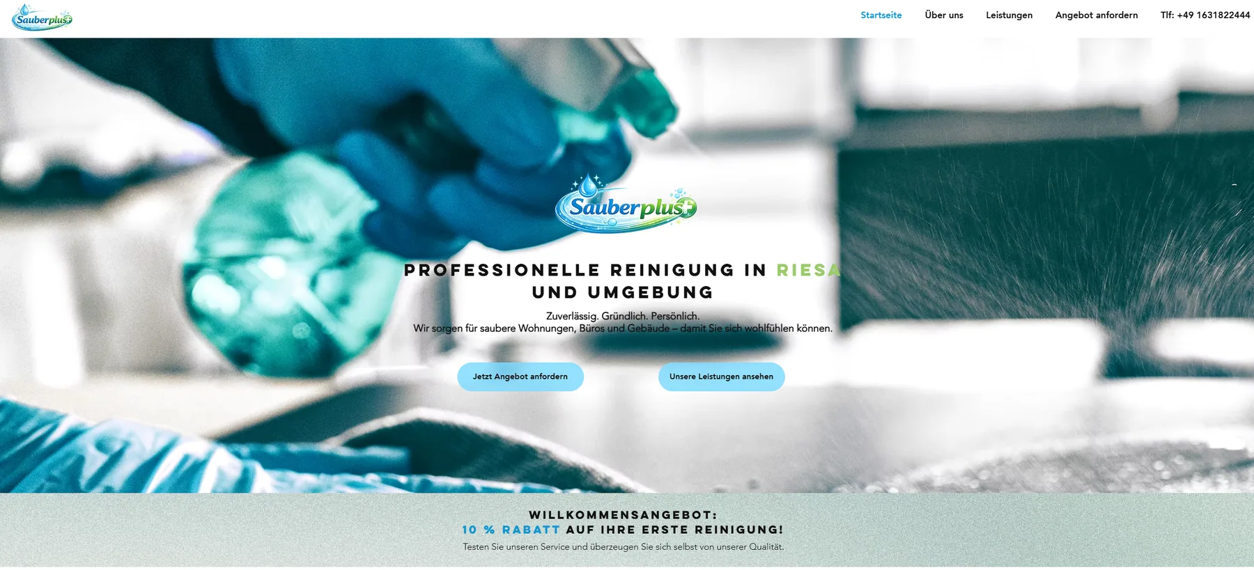
  • Sauberplus home page

    Sauberplus 2026 · Germany

    A cleaning start-up in Riesa. All they had was a logo and a colour palette.

    I built everything else from those two, and had to figure out the legal rules for websites in Germany.

    See the site

Want to work together, or just talk design? Send me a message, I answer everything myself.